Hi all! Welcome to the new Lynda Payne Photography website! I’ve been planning this site in my head for a long time and working on actually creating it for the past couple of months. I’m so excited to finally share it with you! Let me fill you in on how it came to be and what it means to my clients and to me.
I’ve been toying with the idea of updating my logo colors for a while now. I adore my logo, but I wanted a color scheme that would better represent my brand. So I set up a time to work with my graphic designer after the busy holiday season was over. Like I said, I had been thinking about it for some time, so of course, I had created an inspiration board on Pinterest to share with her, and after one meeting, the new color scheme was complete!


Then it was time to work on the website. I had been using a different site to host my galleries and website. But over the past year I’ve made a lot of changes that I think are really great for both my clients and myself. My new gallery hosting site has a shopping cart feature, so clients are able to share their galleries with friends and family following their Viewing & Ordering Session, and they are now able to purchase prints and other artwork right within the gallery rather than emailing me a list of print sizes and file numbers. I have also purchased software that allows me to host all my client forms on my own site and to create an unlimited number of forms. That means that not only is it a more seamless transition from my website to my client forms, but it’s also possible for me to create more forms online, making it easier for clients to respond and easier for me to get more feedback from clients. Questionnaires can now be more specific to the type of session you are doing, and I have already created an online model release, saving us time at your session since you can now fill it out ahead of time! All that was left in order for me to implement my new forms was a site with more customization and hosting capabilities, which brings me back to the design…
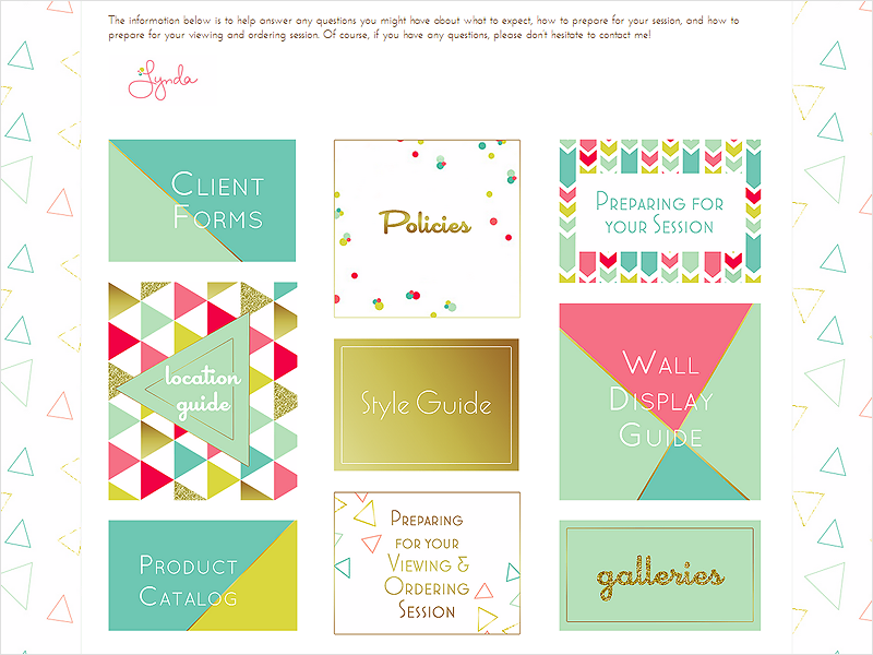
I met with my graphic designer to create the layout and many of the graphic elements you see here on the new site, including the new background which I love! I then spent quite a few hours creating new content and designing more graphics myself. One of the biggest changes I’ve made to the site itself is the addition of a new section exclusively for my clients! It brings together much of the information that was previously emailed to clients at different points throughout their photography experience in one place that’s easily accessible and available to them on demand! I’ve also added additional resources that have been on my wish list for my clients for a while now. You’ll have to become a client in order to get access, but here’s just a little sneak peek of the welcome page.

The new site will surely grow over time with even more information, resources, and images added in the future. One thing you’ll see added very soon… I’ve decided to start using Google+ more, so you’ll soon find new buttons for finding me on Google+ and for sharing blog posts on your Google+ page as well!
I’m so excited to share all these changes with you! There are more exciting things in store for Lynda Payne Photography over the coming months, so stay tuned. Big thanks to my graphic designer, Tiffany at On the Spot Studio for her help in making this site a reality! I hope you’ll take a look around while you’re here, and I’d love to hear what you think, so please leave me a comment to let me know! Happy browsing!


